
OK, I don’t hate this album cover. The photography and art direction are excellent. I love the languid look of the then 49-year-old Glenn Gould, clad in black, with his index finger cocked as if silently playing some classical piece in his head, impatiently waiting for the photographer to finish his work. It’s a pro shot, done by a pro photographer: Don Hunstein was a staff photographer at Columbia records for 30 years.
The cover design is by Henrietta Condak, a pioneer in U.S. graphic design who also worked in the publishing industry, and influenced the likes of Paula Scher and Caren Goldberg. Check out her AIGA profile – I especially like the work she did with her husband and illustrator Cliff Condak.
All in all, a very good cover. It’s just that it doesn’t resonate with me in the same way that the cover of the 1955 recording does…. I should back up a bit.
Glenn Gould was a Canadian pianist and brooding musical genius probably best known for wearing gloves, scarf, and an overcoat in the middle of summer. He played beautifully, with perfect technique and had this amazing habit of humming while he played; you can hear it on many of his recordings. Oh, and it’s Gould’s recording of Bach that was included on Voyager 1.
He died in hospital, only days after this 50th birthday.
His most famous recordings – and there are almost 80 – are perhaps those he made of Bach’s Goldberg Variations. He recorded this then little-known piece twice. Once at the beginning of his career in 1955 and again in 1981. The latter recording is the album I spoke about above.
The 1955 recording, which was also done by Columbia records and made Gould an international star, has the album cover I love the most. It features the 22 year-old Canadian in studio, reproduced in 30 variations (equal to the number of Goldberg Variations) and through a yellow filter. Coupled with a slab serif font, the overall effect of the cover is a modern and hip look that reinforces the energy and youthfulness of the recording, and revolution that it represented to the classical world.
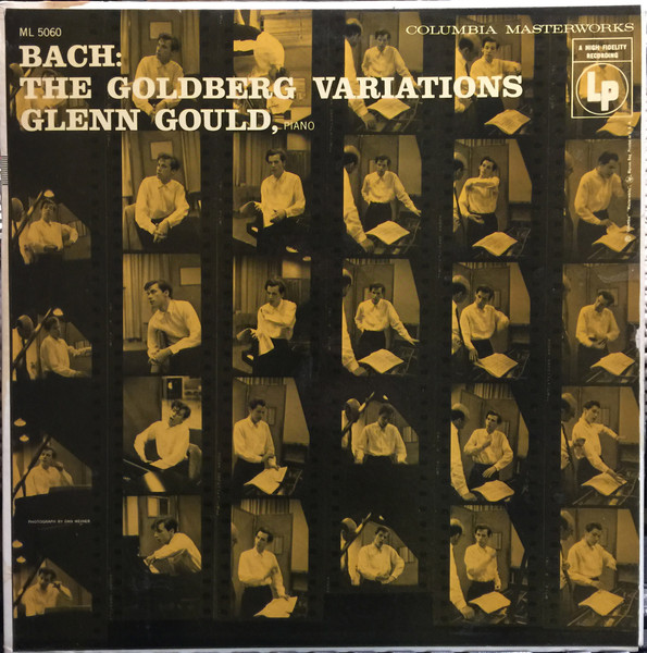
I know who the photographer is – Dan Weiner – because he’s credited on the cover, and my best guess is that S. Neil Fujita was the art director, though he’s not credited. At first, I thought it might have been Alex Steinweiss, who is credited with inventing the modern album cover, but he left Columbia in 1954.
Fujita, who joined Columbia that same year with the mission of building a design department from the ground up, is probably best remembered for the beautiful abstract covers he did for jazz records, including the Dave Brubeck Quartet’s record Time Out. In an interview with Steven Heller, for AIGA’s Voice, Fujita talks about sending a photographer to the studio with Gould.
In any case, it’s this album cover that really captures the music and the young musician for me; his nervous energy and the emotion of the music in a way that the 1981 cover does not. Which is why I decided to redesign it.
I wanted to recapture some of the energy of the 1955 cover, while maintaining the maturity of the 1981 cover, but also add a bit of Canadianness to it as well. Glenn Gould, like many Canadians, found fame and fortune in the U.S., but he never forgot where he came from. He even used to call music “his North.”
I was really inspired by the contents of the digital archive Canada Modern and tried to capture some of that time in this piece.